When Apple released the first iPhone, its 3.5-inch touchscreen seemed huge compared to the displays of other phones. Nonetheless, competitors responded with even larger screens, trying to find areas where they could provide clear alternatives to Apple hardware. Consumers responded positively, so the competition started making even bigger phones.
Whatever good reasons Apple had for sticking with its 3.5-inch (and later 4-inch) screens—and there are good reasons, including the fact that it’s hard to hold and control larger phones—it also meant it was ceding the large end of the market to the likes of Samsung.
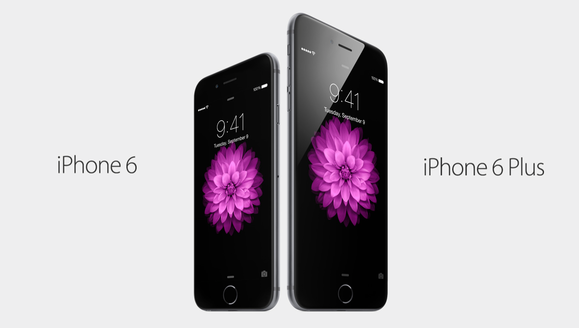
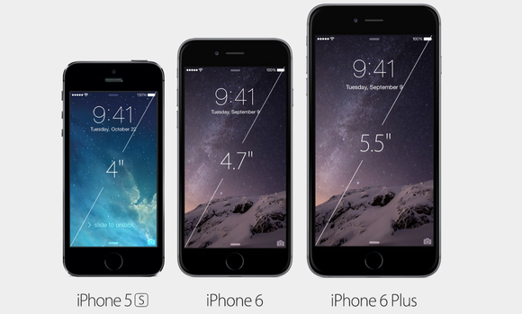
The iPhone 6 and 6 Plus are Apple’s reply to the success of large Android phones. The iPhone 6 measures 4.7 inches, while the iPhone 6 Plus comes in at 5.5 inches. Both models will help Apple reach an audience that just wasn’t being served by the 4-inch iPhone 5s and 5c—though the company also risks alienating people who actually preferred the smaller screens.
Twin wonders
The iPhone 6 and iPhone 6 Plus are essentially the same device, with differently sized displays and only a few minor internal variations. The phones’ release marks the first time Apple has launched two entirely new iPhones simultaneously, as last year’s iPhone 5c was really just an iPhone 5 with a different body.
Hold an iPhone 6 in your hand for the first time, and you can tell it’s a very different device from the iPhones of the past four years. Gone is the more industrial feel of the iPhone 4 and 5, with their straight sides and chamfered edges. The new phones have rounded edges, more akin to the iPod touch, iPad, and even the very first iPhone.
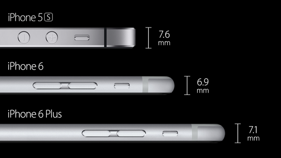
If the iPhone 6 used the same design as the iPhone 5, but were larger, it would feel immense. But even though the iPhone 6 is slightly heavier than the iPhone 5, its curved edges (not just the metal, but the edges of the glass front are curved) and thinness save it from feeling like an oversized monstrosity. After a few days, I found I had unconsciously changed the default position of my fingers when holding the phone, and using it felt entirely natural.
Then there’s the iPhone 6 Plus. While I wouldn’t call it an “oversized monstrosity,” it’s definitely huge. As with the iPhone 6, the iPhone 6 Plus’s thinness and curved edges do offset the extra size somewhat. However, you will never mistake the iPhone 6 Plus for the iPhone 6. It’s three-quarters of an inch (or roughly 14 percent) wider. In my average-size male hands, I found I could hold the iPhone 6 Plus, and manage to get my thumb to reach across the screen, at the very bottom, if I concentrated. But beyond looking at the huge screen and doing some simple gestures, this seems to be a device that’s made for two-handed operation.
That’s not necessarily bad—I often use my iPhone two-handed, though sometimes I casually flip through it with one hand, and that wouldn’t happen were I to sport the iPhone 6 Plus. For people with large hands, it’ll be less of an issue. I also discovered, to my surprise, that the front pockets of my Levi’s jeans were able to hold the iPhone 6 Plus without any problem. Your pockets may vary, but I was able to tote a 6 Plus in the same pocket that I usually carry my iPhone 5. While the feel was different, it wasn’t ridiculous.
That being said, the iPhone 6 Plus is unlike any iPhone before it. Not quite a phone, not yet an iPad, it’s a tweener of a device that’s going to be fantastic for some people and completely wrong for others. In Asia, this size of device is quite popular—for many people, phablets are their only computing devices, so the large screen is a huge productivity boost. And if you’re someone who would really rather not have an iPad, a larger iPhone makes sense. And if you’re someone for whom bigger is always better, why not get the biggest iPhone around?
If you don’t find yourself nodding at that sentiment, I strongly suggest that you visit an Apple Store or another retailer that stocks the iPhone 6 Plus, hold it in your hand, and try it out. It’s really a different class of device, and I fear that a lot of people are going to rush into buying one without having a sense of the scale of the thing.
Beyond the curved sides and two sizes, there are numerous other hardware design changes that Apple has introduced with the iPhone 6. The iPhone 5’s round volume buttons have been replaced with thin metal ovals set into a slightly recessed indent just below the silence switch. The sleep/wake button has retreated from the phone’s top (thus completing the evacuation—there’s nothing left up there), and moved to the right side, a first for an iPhone. For longtime iPhone users, it’s going to take some getting used to, but on larger phones it’s harder to reach that top edge, hence the change. I still haven’t gotten used to it.
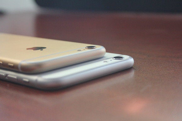
On the back of the device, the most noticeable change is that the camera now extends outward a bit, its lens surrounded by a thin metal ring. It’s a subtle change, and you can still place the iPhone flat on its back with a minimum of rocking. But it definitely won’t be perfectly level.
It’s what’s on the inside
The exterior design of the iPhone 6 line marks a change for the iPhone product line, but these models also come with some internal hardware upgrades. They’re powered by the new Apple A8 chip, the latest in a long line of chips Apple designs itself, optimized for its own hardware.
The jump to the 64-bit A7 processor last year brought a massive increase in performance to iOS devices. In fact, the A7 offered so much speed improvement, there was no way that the A8 could match the same percentage increase. It’s definitely faster than last year’s processor, but by a more modest amount. Apple’s chart of iPhone performance, which had been depicting exponential growth, shows signs of slowing. (However, it’s worth noting the A8 chip uses a smaller manufacturing process, and is much more power efficient than the previous model.)
As with the iPad Air and iPad mini with Retina display released last year, the iPhone 6 and iPhone 6 Plus are running the same processor, but at different clock speeds. Presumably, the clock-speed difference is tied into battery-life or heat concerns, or both. The iPhone 6’s A8 processor runs at 1.2GHz, while the iPhone 6 Plus clocks in at 1.39GHz, according to GeekBench. Both phones appear to have the same 1GB of memory as last year’s devices.
Higher scores/longer bars are better.
Apple claims that the iPhone 6 has slighty better battery life than the iPhone 5s, and that the iPhone 6 Plus has quite a bit better battery life than that. Unfortunately, I didn’t have time to run comprehensive battery tests for this review, and of course battery life can vary massively depending on how you use the device. That said, after spending a long weekend with the two devices, I can corroborate Apple’s claims.
The iPhone 6 definitely appeared to have longer battery life than my iPhone 5s—though, to be fair, that iPhone has been in use for a year, and so its battery isn’t fresh. The iPhone 6 Plus definitely seems to be the longest-lived iPhone so far, but does its battery last long enough to obviate the need for a battery case or external battery for emergencies? I just can’t say quite yet.
Apple says that the iPhone 6 and 6 Plus also sport a new version of its motion coprocessor, the M8. This chip collects sensor data as you use your iPhone, even if the A8 processor is resting. The new version takes advantage of the iPhone 6 line’s barometer, a sensor that lets it gauge elevation changes—such as when you’ve climbed up a flight of stairs.
Finally, these are the first iPhones to support Near Field Communication, or NFC, as a part of the forthcoming Apple Pay service. There’s a Whole Foods a short walking distance from my house, and I’m looking forward to buying peanut butter and beer by moving my iPhone 6 to within an inch of the NFC reader, using Touch ID to verify my identity, and then taking off. But because Apple Pay won’t work until October, I couldn’t test that feature now.
On displays
Apple has dubbed the screen on both iPhone 6 models “Retina HD,” a strange and somewhat redundant label. In reality, the iPhone 6’s 4.7-inch display has the same screen density (326 pixels per inch) as the iPhone 5 line. The pixels aren’t packed any tighter on the iPhone 6—there are just more of them, because the screen is 110 pixels wider and 198 pixels taller.
The iPhone 6 Plus is a different story. Its 5.5-inch screen (measured diagonally) has a resolution of 401 pixels per inch, the most ever on an iOS device. That means it’s a full 1080p display—the equivalent of a high-definition TV in your (biggest) pocket.
Before we go on, a note about resolutions and scaling, since it can get a little complicated. There are really two ways to measure displays: How big they are (inches) and how many individual dots they can contain (pixels). When we talk about a display’s pixels per inch, we’re describing how small the dots are—effectively, how many of them are packed in any square-inch of a display. These days, most TVs have exactly the same number of dots: 1080 rows and 1920 columns, or roughly 2 million dots. On a 60-inch TV, they’re just less densely distributed than on a 40-inch model. And that same resolution on the iPhone plus is packed into a 5.5-inch space—it’s effectively a 5.5-inch HDTV.
In fact, the iPhone 6 Plus so large and so densely packed with pixels that it has actually caused Apple to change the way it handles drawing on its screen. Borrowing a technique Apple used on the MacBook Pro with Retina Display, the iPhone 6 Plus actually renders its interface at 2208 by 1242 pixels. This is a resolution that scales linearly from the displays used on previous iOS devices, which is perfect—except that the iPhone 6 Plus’s screen only measures 1920 by 1080 pixels! So to make the entire image fit, the iPhone 6 Plus reduces the entire interface—scaling it down to 1920 by 1080—in order to make it fit on the display.
Scaling displays used to be something that simply wasn’t done, because it can create weird artifacts and fuzziness (and requires a lot of graphics power). If you’ve ever tried to use a non-Retina Mac display at a non-native resolution, you know what I’m talking about. But the thing about Retina displays is, the individual pixels are so small that most of the fuzziness is happening on a scale that’s just too small to see. The display of the iPhone 6 Plus, like that of the Retina MacBook Pro, looks just fine—despite a whole lot of hardware and software working hard behind the scenes to make sure the math adds up.
An advantage of embracing scaling on high-resolution devices is that Apple can apply it in other ways, too. Apps that haven’t been updated for the iPhone 6’s larger displays simply scale up to fit the new size. Everything’s just a bit bigger, and if you look carefully you can notice the difference, but the apps still work just fine.
Apple has also added a feature called Display Zoom that’s essentially the software version of those “large-print edition” books used by people with vision problems. When you turn Display Zoom on, the phone emulates the display of a smaller phone and then scales it up to full size. This is a great feature for anyone who feels like the content on their iPhone is just too small. It also means that while these phones are bigger, that bigness can either provide more room or just make everything larger. We all get to pick. Nicely done.
Without Display Zoom turned on, these devices have enough extra screen real estate for Apple to add new columns of buttons to the sides of the standard iOS keyboard—but only when held in landscape orientation. (In portrait orientation, the keyboard feels a bit bigger, but it’s still the standard iPhone keyboard.) In landscape mode on the iPhone 6 Plus, the left side of the keyboard lets you cut, copy, paste, bold text, and undo an action, in addition to triggering international or Emoji keyboards and voice dictation. On the right side of the keyboard, you can move the cursor forward or backward, add an exclamation point or question mark, comma or period.

On the iPhone 6, which is quite a bit narrower than the iPhone 6 Plus, the additional commands are an undo button and a comma on the left side, and cursor keys and a period on the right side. (Since these phones also run iOS 8, they also offer the new optional QuickType suggestion bar at the top of the keyboard, and will support third-party keyboards if you don’t want to use the default.)
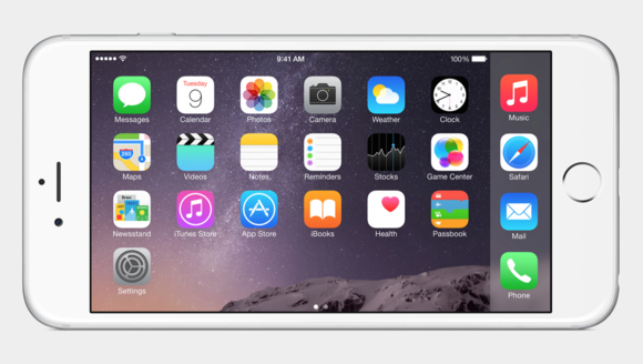
On the iPhone 6 Plus, Apple has updated several of its apps, including Mail and Notes, so that they also behave differently when they’ve got the ultra-wide field of view in landscape mode. Both apps switch to a two-column view, with a list of items on the left and a preview or editing area on the right—the same behavior that you’d see when you rotate those apps from portrait to landscape on the iPad. Even the iPhone home screen has gotten into the action, rotating for the very first time on the iPhone 6 plus. (The Dock, you’ll be interested to know, slides to the right side of the screen rather than stretching out across the bottom a la the iPad.)
But for all the features a large screen can bring, the fact is that it’s very hard for someone using the device one-handed to reach the top of that screen. Apple’s creative solution is a new feature called Reachability. Put simply, Reachability slides the top of the screen down to where your thumb can reach it. To activate Reachability, you tap twice on the home button (without pushing—the touch ID sensor can tell when you’re just touching). Everything on the top half of the screen slides down, bringing it within reach.
Reachability isn’t the most elegant concept I’ve seen Apple develop, but it does make the size of these phones more manageable when you’re using only one hand. After a few days, Reachability became something that I used without thinking, and it generally did what I needed it to. However, I did find it to be a bit inconsistent. The iPhone home screen doesn’t slide all the way down, for instance—it scrolls the main icons down, leaving the dock and the top bar where they were. No other app interacts with Reachability in this way.
I also found that in some cases, the contents of the screen immediately snapped back to the top when I tapped something. In other cases, there was a pause of a second or so after a tap, enough time to tap something else, or scroll, or interact with the interface in other ways. I don’t like this inconsistency, and in general I think it would be better if the iPhone always waited a second to make sure everything’s done before turning off Reachability. Right now, I never really know what’s going to happen when I tap something when in Reachability mode, and that’s not good.
Sharper focus
Every new iPhone model generally brings an upgraded camera. This year’s models haven’t improved on the iPhone 5s in terms of megapixels—these phones still have 8-megapixel cameras—but add a raft of new features intended to improve the photo- and video-taking experiences.
Focus is improved in several ways. Apple says that it’s added dedicated “focus pixels” to the camera, which help it autofocus faster. Face-detection algorithms have been improved. And there are improvements to autofocus performance on video. The focus behavior in video is the feature I noticed the most—video focus has never been really been one of the iPhone’s strong suits. But the focus in the test videos I shot with the iPhone 6 and iPhone 6 Plus were clear and smooth, never seeming robotic or jarring.
The super slow-mo feature means you can now shoot at 240 frames per second, allowing for smooth action that runs at one-eighth the speed of normal video. That feature, combined with improved video stabilization that makes videos feel surprisingly smooth, should make videos of skateboard tricks and swimming pool dives more impressive than ever before.
The major difference between the two cameras is really only a factor when in low-light situations. The iPhone 6 Plus camera has the added ability to do optical image stabilization, where the camera hardware actually moves as you do in order to minimize blurriness in dark situations where the camera’s sensors need more time to absorb light in order to get a viewable picture. There are also software techniques Apple uses in low-light situations, but only the larger camera actually has physical stabilization hardware.
The bottom line
Make no mistake: The most important new thing about the iPhone 6 and iPhone 6 Plus is their size. While their processors run faster and their cameras focus more exactingly, the real story is that these are larger phones with larger screens. That’s better for displaying photos and videos, of course, and often for just allowing more information to fit on the screen. But there’s also a cost: The smaller your hands are, the harder these phones are to handle.
I’ll wager that for most iPhone 5 users, the iPhone 6 will be a solid upgrade, and after a few days of adjustment, they’ll never miss their old iPhones. As for the iPhone 6 Plus, it’s a device that will undoubtedly find its adherents. They might be people who use their iPhones constantly and also need as much battery power as possible, or people with large hands, or people for whom it will be the only computing device they’ll use every day. Samsung and other competitors have showed that there’s an audience for extra-large phones—and that’s now an audience that can buy an iPhone. That’s the whole point.
Jason is the former editorial director of Macworld, and has reviewed every major Apple product of the last few years, including the original iPhone and iPad as well as every major version of Mac OS X. Check out Sixcolors.com for his latest Apple coverage.


